Are you looking for bathroom color schemes? Your bathroom is more than just a functional space. It’s the epicenter where you choose to be yourself and unwind.
Choosing the right color scheme can make all the difference in creating a sanctuary that truly reflects your personal style and helps you relax and rejuvenate.
With the help of our inspiring bathroom color schemes, you can transform your bathroom into a functional and aesthetically pleasing space.
Your bathroom is where you start and end your day, so why not make it a space you truly love?
Choosing the right color scheme can completely transform your bathroom into a personal sanctuary that soothes and uplifts your spirits. Whether you’re a fan of classic neutrals, bold and vibrant hues, or subtle pastels, we’ve got you covered.
Our comprehensive guide on the 18 Best Bathroom Color Schemes explores a range of beautiful color combinations that will inspire you.
1. Classic White and Gray
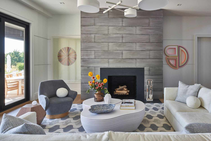
It creates a classic and lovely appearance by blending white and grey. It is a flexible color scheme that goes well with several accent colors and can be used in modern and conventional spaces.
Features
- Elegant color scheme
- Adaptable to different styles
- Complements a wide range of accent colors
- Clean and fresh atmosphere
Similar Post: 15 Coastal Living Room Color Palettes to Bring the Beach to Your Home
2. Soft Pastels
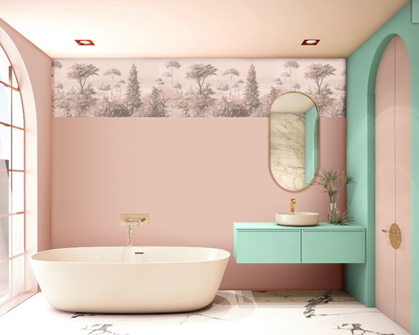
Soft pastels are a delicate and muted color palette that typically consists of pale shades of pink, blue, yellow, green, and lavender.
This color combination is prevalent in interior design, clothing, and art since it is frequently connected to spring and has a peaceful and soothing impact.
Features
- The muted and gentle color palette
- The calming and peaceful atmosphere
- It can be used in different styles
- Adds a touch of romance, vintage, or whimsy to a space.
3. Bold and Vibrant
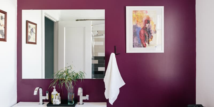
This color scheme is alive and dynamic, using powerful shades of red, orange, yellow, green, blue, and purple.
They are typically used to make an impression and provide a pop of color to a space. Bold, vibrant colors can be used to add drama and excitement to a space as well as to foster a lively and enjoyable mood.
Features
- Energetic color scheme
- Adds a pop of color
- Creates a playful atmosphere
- Adds drama and excitement to a room.
4. Coastal Blues
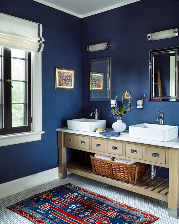
The hues of the sea and the beach influences coastal blues. This color scheme features a variety of blues, including sand beige, white, and accents in deep, gloomy navy and light, airy pastel blues.
Coastal blues are popular in coastal and beach-inspired interior design because they are frequently connected to a calm and serene mood.
Features
- Inspired by the colors of the ocean and beach
- Includes a range of blues, from light pastels to deep navy
- Accented by sandy beige and white
- The relaxed and serene atmosphere
5. Rustic Earth Tones
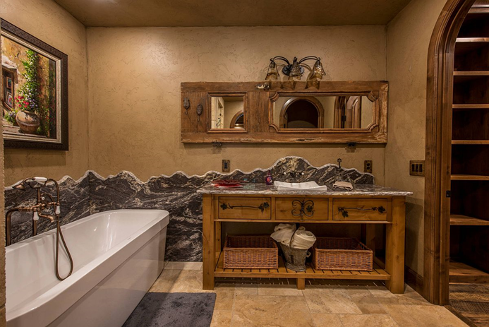
This palette includes warm browns, burnt oranges, deep reds, and mustard yellows.
Rustic earth tones are often used to create a cozy and welcoming atmosphere and are popular in rustic or farmhouse-inspired interior design.
Features
- Warm and rich colors found in nature
- Includes warm browns, burnt oranges, deep reds, and mustard yellows
- Creates a cozy and welcoming atmosphere
6. Moody Grays
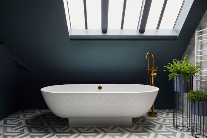
To enhance depth and contrast, this palette frequently combines warm browns and taupes with cold blues and purples.
Dark greys can add a feeling of drama and refinement to home designs with a contemporary or industrial feel.
Features
- Sophisticated color palette
- Features a range of gray shades with cool blues and purples.
- Contemporary and industrial-inspired interior design
7. Elegant Black and White
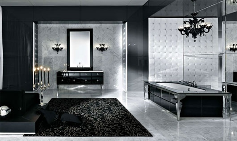
A classic and timeless color combination, elegant black and white mixes the strong contrast of black and white to provide a striking appearance.
This color scheme is adaptable and may be utilized in a variety of ways, from classic to modern, and it can be enhanced with metallics like gold and silver.
Elegant black and white is well-liked in fashion and interior design because it lends an air of refinement and glitz.
Features
- Classic color scheme
- Combines the stark contrast of black and white
- Versatile
- It can be accentuated with metallics for added glamour
Also Read: Which Colours Blends Best with Grey Kitchen Unit or Cabinets?
8. Happy Yellows
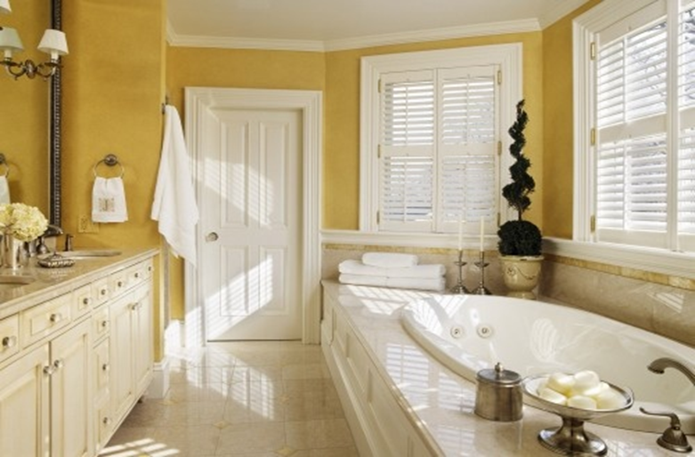
Happy yellows are a cheery color scheme that features a variety of yellow tones, from delicate pastels to strong, vivid hues.
In order to create a cheerful and lively ambiance, this color scheme is frequently complemented with other vibrant hues, such as pink, orange, and green.
Because they can infuse a place with a little extra vigour and optimism, cheerful yellows are popular in both fashion and interior design.
Features
- Bright and cheerful color scheme
- Includes a range of yellow shades from soft pastels to bold and vibrant hues
- Often accented with other bright colors to create a playful and lively atmosphere.
9. Natural Greens
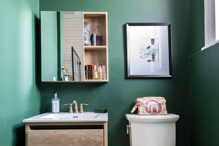
A color scheme that mimics the calming and energizing hues found in nature is one that uses natural greens.
Along with earthy browns and white, this palette features a variety of greens, from delicate pastels to deep forest tones.
Natural greens are frequently utilized in interior design, especially in eco-friendly and sustainable design, to create a tranquil and pleasant ambiance.
Features
- Refreshing color scheme
- Includes a range of greens, from soft pastels to deep forest hues, as well as earthy browns and whites
- The calming and peaceful atmosphere
10. Soft Pink
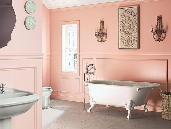
Light pink, blush, and rose hues make up the delicate and feminine color scheme known as “soft pinks.”
This color scheme is common in interior design, clothing, and beauty because it helps to create a romantic and endearing atmosphere.
For a dreamy and ethereal appearance, gentle pinks can be used with other delicate pastels, while strong and brilliant hues can be used to create a lively and playful contrast.
Features
- Delicate and feminine color palette
- Includes light shades of pink, blush, and rose
- Romantic and charming atmosphere
11. Retro-Inspired
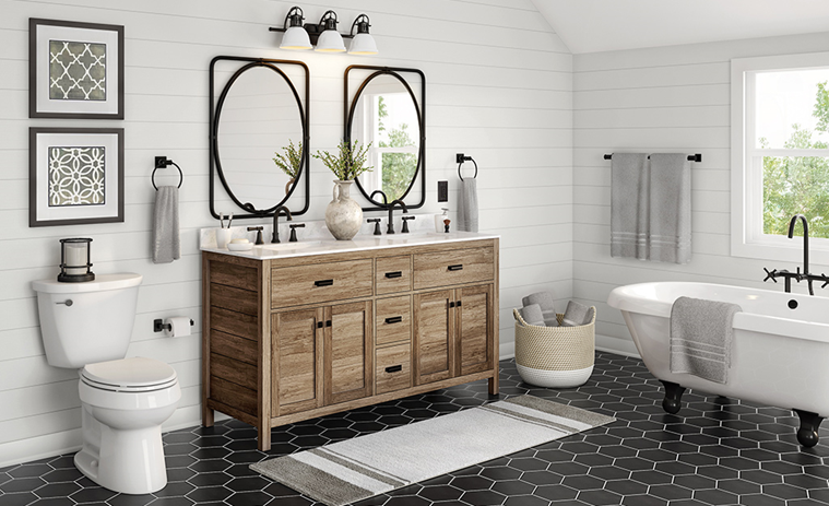
Retro-inspired color schemes get their inspiration from vintage design eras, mainly the 1950s to the 1980s.
This color scheme frequently combines mild hues like avocado green and mustard yellow with vivid hues like teal, pink, yellow, and orange.
Retro color palettes are popular in interior design, clothing, and graphic design and can be utilized to infuse an aura of joy and nostalgia.
Features
- Inspired by design styles of the past, particularly from the 1950s to the 1980s
- Includes bright and bold colors such as teal, pink, yellow, and orange.
12. Minimalist Black
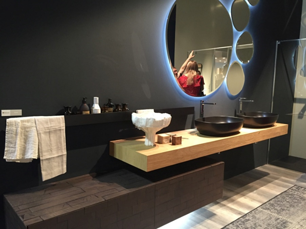
Black is used as the main color in minimalist black bathroom color schemes, which are straightforward yet striking.
This palette frequently uses white and grey tones to provide depth and contrast. In addition, modern and minimalist home design often features minimalist black, which can convey a sense of sophistication and elegance.
Features
- Simple yet bold color scheme
- Characterized by the use of black as the primary color
- Shades of gray and white to add depth and contrast
See More: 28 Small House Open Concept Kitchen Ideas
13. Neutral Beige
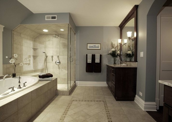
A variety of beige hues, from light cream to warm taupe, are included in the soft and understated color scheme known as neutral beige.
This color scheme is frequently used in interior design, especially in classic and farmhouse-inspired styles, to create a warm and welcoming feeling.
Beige is a neutral color that can be combined with other neutrals to create a monochromatic look or with strong, vivid colors to create a contrast.
Features
- Soft and subtle color scheme
- Includes a range of beige shades, from light cream to warm taupe
- Cozy and inviting atmosphere
- Popular in interior design, particularly in traditional and farmhouse-inspired styles
14. Cool Grays and Blues
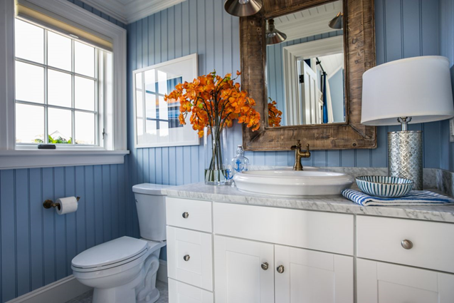
A color scheme known as “cool greys and blues” combines various grey tones with cool, relaxing blues.
This color scheme is frequently used in interior design for bedrooms, bathrooms, and spa-like places to create a calming and soothing atmosphere.
Cool greys and blues can also be combined with warm wood tones or metallic accents for a stylish and modern appearance.
Features
- Shades of gray with cool and calming blues
- Serene atmosphere
- Popular in interior design for bedrooms, bathrooms, and spa-like spaces
15. Jewel Tones
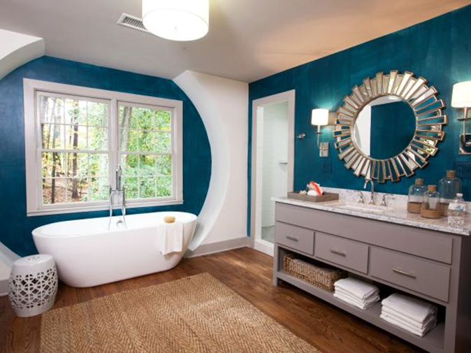
Rich, striking hues that are inspired by gemstones make up the colorful, opulent color scheme known as jewel tones.
This palette frequently features rich hues of magenta, turquoise, and gold along with deep tints of emerald green, sapphire blue, ruby red, and amethyst purple.
Jewel tones are popular in jewellery, fashion, and interior design and can give any space a dash of glitz and sophistication.
Features
- Vibrant and luxurious color scheme
- Inspired by gemstones, it includes rich and bold colors
- Popular in interior design, fashion, and jewelry
16. Vintage-Inspired
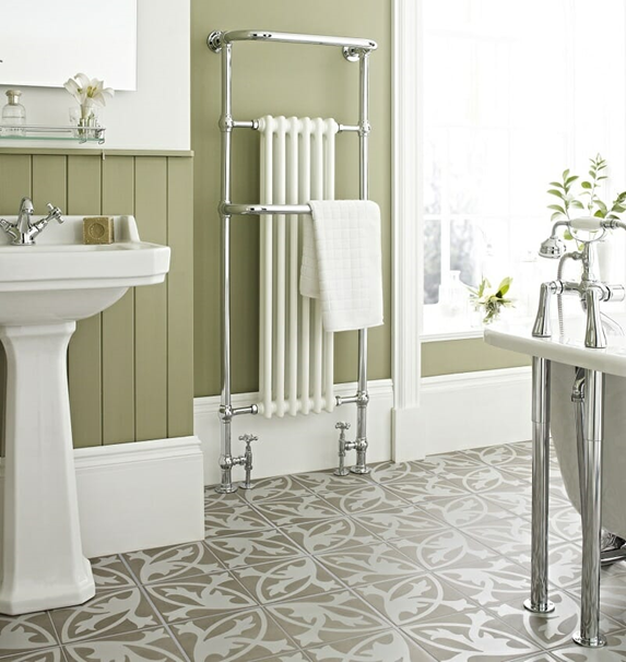
A color scheme described as vintage-inspired draws inspiration from earlier design eras, mainly the 1920s to the 1970s.
This bathroom color scheme frequently combines warm, earthy tones like mustard yellow, burnt orange, and red with soft pastels like blush pink, mint green, and baby blue.
Vintage color palettes are popular in interior design, clothing, and graphic design and can be used to infuse an environment with nostalgia and charm.
Features
- Inspired by design styles of the past, particularly from the 1920s to the 1970s
- Includes muted pastels such as blush pink, mint green, and baby blue.
- Popular in interior design, fashion, and graphic design
17. Monochromatic
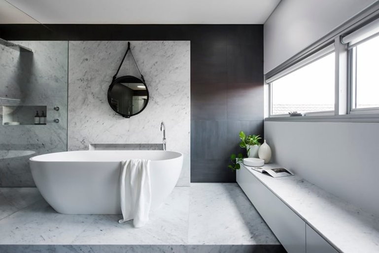
A monochromatic color scheme uses numerous tones, tints, and shades of a single primary color.
This color scheme is popular in contemporary and minimalist interior design because it may produce a relaxing and harmonious ambiance.
Additionally, monochromatic color schemes can draw attention to various patterns and textures in a room or make a dramatic and outlandish statement with only one color.
Features
- Different shades, tints, and tones of that color
- Calming and cohesive atmosphere
- Modern and minimalist-inspired interior design
Related: 11 Easy Coastal Decor Ideas for Your Small Living Room
18. Warm Orange and Red
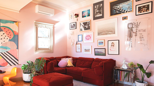
It combines the energizing and cozy shades of orange and red. This color scheme is popular in interior design for living rooms, dining rooms, and other social spaces because it can produce a warm and welcoming feeling.
However, warm reds and oranges can also be used with cool complementary colors like blue or green to create a lively and dramatic contrast or neutrals like beige or grey to create a balanced and harmonious aesthetic.
Features
- Energizing hues of orange and red
- The cozy and inviting atmosphere
- Popular in interior design for living rooms, dining rooms, and more.
Conclusion
Your bathroom is a sanctuary where you begin and end each day, not merely a room for practical purposes.
So your bathroom’s color scheme may make a huge difference in whether it genuinely reflects your unique style and promotes relaxation and rejuvenation.
Our article on the 18 Best Bathroom Color Schemes has explored various colors to suit every taste, from traditional and subtle tones to bright and vibrant hues.
Our guide offers everything you need to design the bathroom of your dreams, whether you choose a tranquil and relaxing refuge or a colorful and energizing area.
Check This Next: 17 Bedroom Paint Ideas – Pick the Best Color for Your Bedroom Walls


